
Definition:
Inclusive design takes into account the vast diversity of the human race and is mindful of people’s differing abilities, languages and backgrounds. “It empowers designers to create products whose experiences serve as many people as possible” (Morales, Adobe).
Examples of Inclusive Design:
For example, a way to make a website more inclusive; “opt for legible fonts and offer a button for users in increase the font size.” ( Joyce, Inclusive Design).
Challenge:
This Design Challenge allows you to explore what details make a design inclusive.
Learning Outcomes:
Participants will be able to identify aspects that make websites inclusive to all people.
Directions:
- Set up the test: Copy or save the images below.
- Explain the test: From the various images you saved, pick out which one looks the most inclusive and determine what aspects of the website design make it inclusive.
Sources:
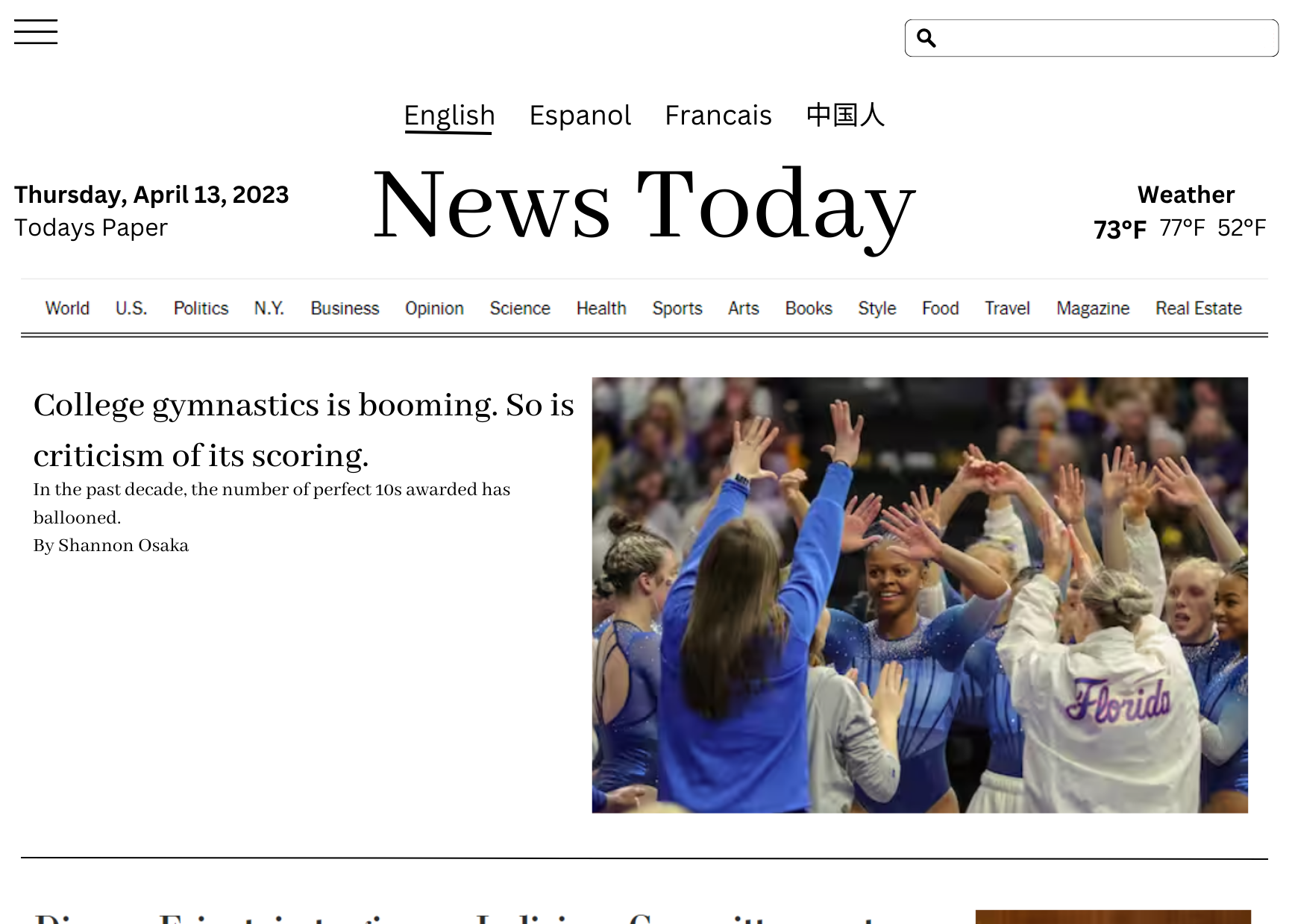
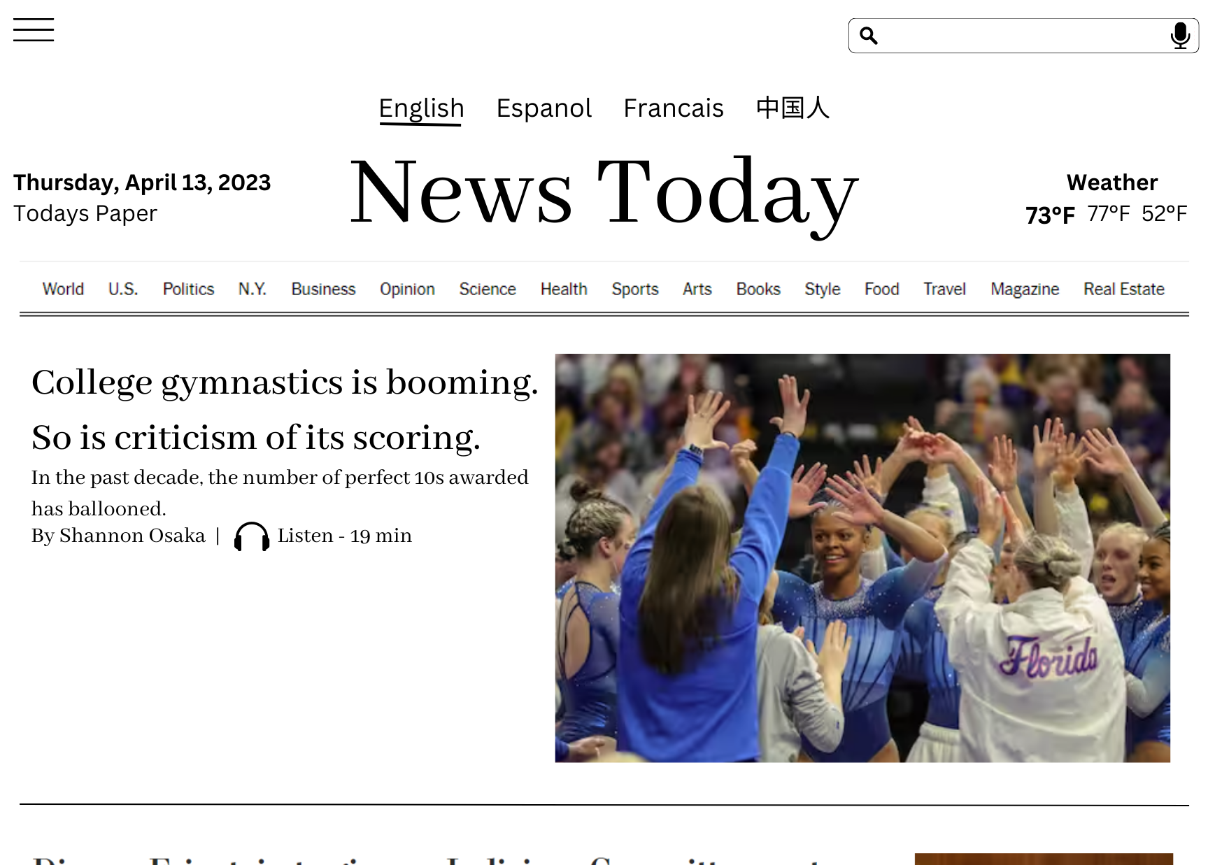
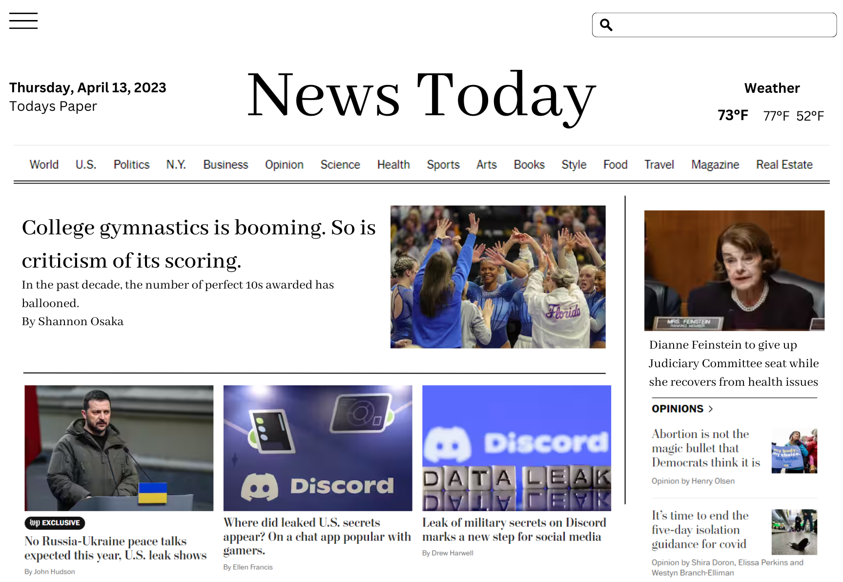
I believe that Design-2 is the most inclusive because it has large text, an audio file for those unable to read, does not have tons of other information surrounding it to distract, and has language options across the top.
I agree with Isabelle that design 2 seems the most inclusive. The first thing that stood out to me was the larger image and text that make it easier to read, as well as the overall simpler layout of the page. The most inclusive thing I notice, though, was the “listen” feature next to the author’s name.
Design 2 looks the most inclusive because the font is the largest and it includes an audio option for the article as well as different language options at the top of the page.