Description
Accessibility is a category of usability that focuses on making website details/features available for all users. Accessibility focuses on more technical features such as fonts, colors, categorization, and more. It’s important that users from all demographics are able to access website material in a way that is overall beneficial. If a website isn’t accessible to all users, it isn’t considered usable. Each user should be able to benefit from the website without encountering challenges such as small fonts, colors that mute text or make it inaccessible, or anything else that would limit inclusion. Each user’s experience should be extremely similar and inclusive.
Design Challenge
Learning Outcome: Participants will be able to identify accessible fonts and colors.
Directions:
- Decide your roles. One person will be the tester, the other the participant.
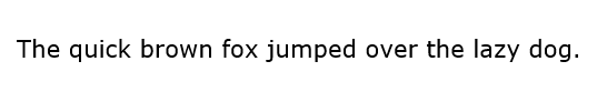
- Set up the test. Copy or save the images below. Be prepared to show them to your participant.
- Explain the test. Tell the participant that you are revising the style of a website and are seeking their feedback on different fonts and colors to use.
- Ask the participant to choose fonts and colors. Have the participant identify the fonts and colors that they prefer from the images.
- Which combinations catch their eye?
- Which combinations do they dislike?
- Give the participant the reins. Using the Contrast Checker1, have the participant play around with colors they believe are accessible.
- Take notes. Record what your participant says. Ask for reasoning when going through the images.
- Compare results. Using this chart, determine accessible and inaccessible colors. Web Content Accessibility Guidelines (WCAG) require a contrast ratio of at least 4.5:1 for normal text and 3:1 for large text to achieve Level AA compliance. To achieve Level AAA compliance requires a contrast ratio of at least 7:1 for normal text and 4.5:1 for large text. Large text is defined as 14 point (typically 18.66px) and bold or larger, or 18 point (typically 24px) or larger.5

- Personalize. Adapt this challenge for your own product.
Deliverable: Document what font/color combinations users found most accessible.
Sources
- https://www.accessi.org/contrast-checker
- https://uxdesign.cc/accessibility-guidelines-for-a-ux-designer-c3ba775539be
- https://accessibility.digital.gov/ux/getting-started/
- https://xd.adobe.com/ideas/principles/web-design/what-is-accessible-design/
- https://brand.ucla.edu/fundamentals/accessibility/color-type#:~:text=Color%20Contrast,-Color%20contrast%20is&text=Web%20Content%20Accessibility%20Guidelines%20(WCAG,4.5%3A1%20for%20large%20text.